

My Role:
UX Designer, Data organizer, Dashboard designer
Year:
2026
Tools:
Google Sheets, Google Charts
Type:
Personal Project
In training for my frst HYROX race, I wanted to create a training analytics dashboard to optimize my work out split to balance strength, cardio, pilates, and mobility.
Training data was spread across multiple platforms and individual workouts, making it difficult to understand progress over time. This included apps like Strava, Runna, Solidcore, and RepCount (a weight training app).
I wanted a single source of truth that could help me evaluate consistency, identify trends, and make better training decisions.
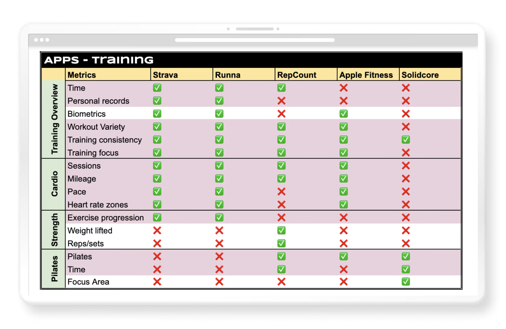
I evaluated existing fitness tracking tools and identified what information is most valuable for making informed training decisions. This had the goal of empowering users to interpret trends themselves.
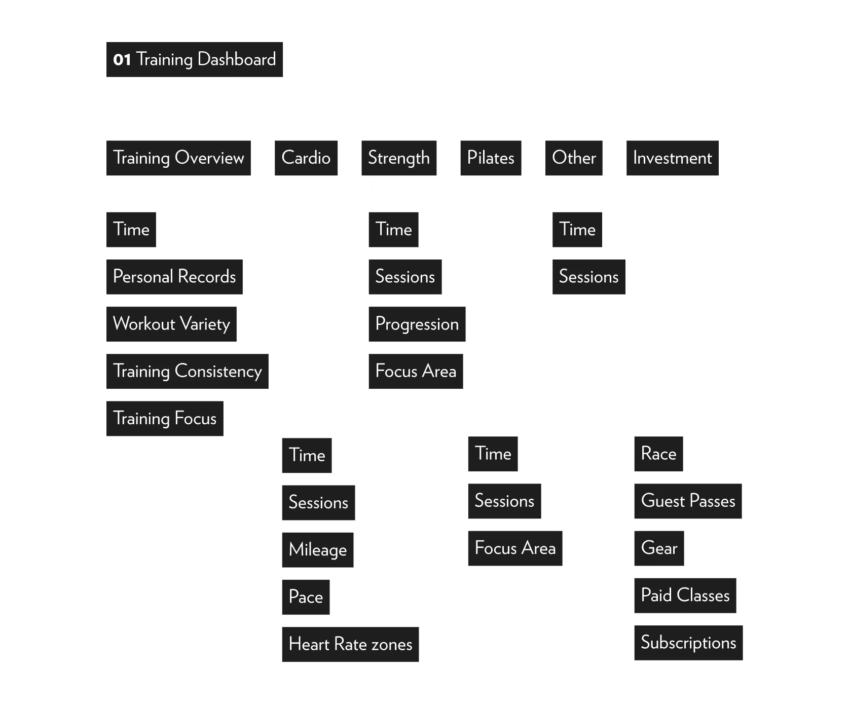
Using the research to make informed decisions, I then played with the information architecture. This loosely follows the spreadsheet above, with the addition of two other categories: Other and Investment.
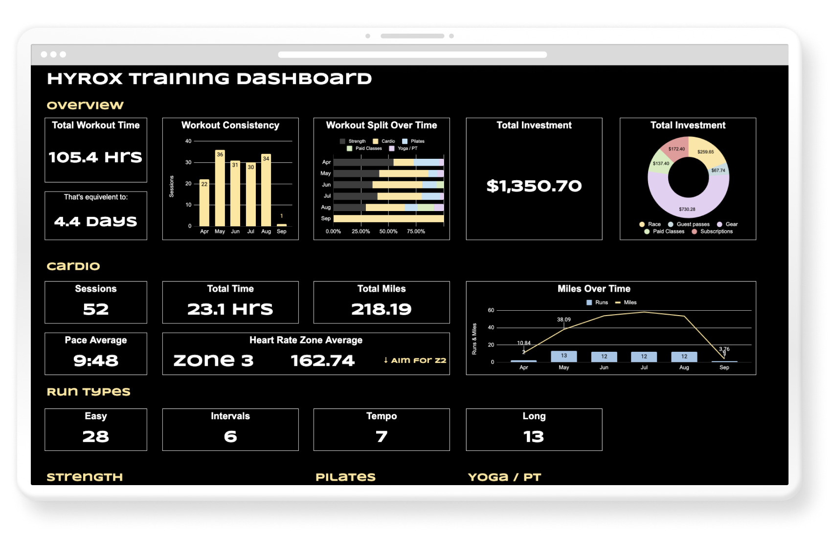
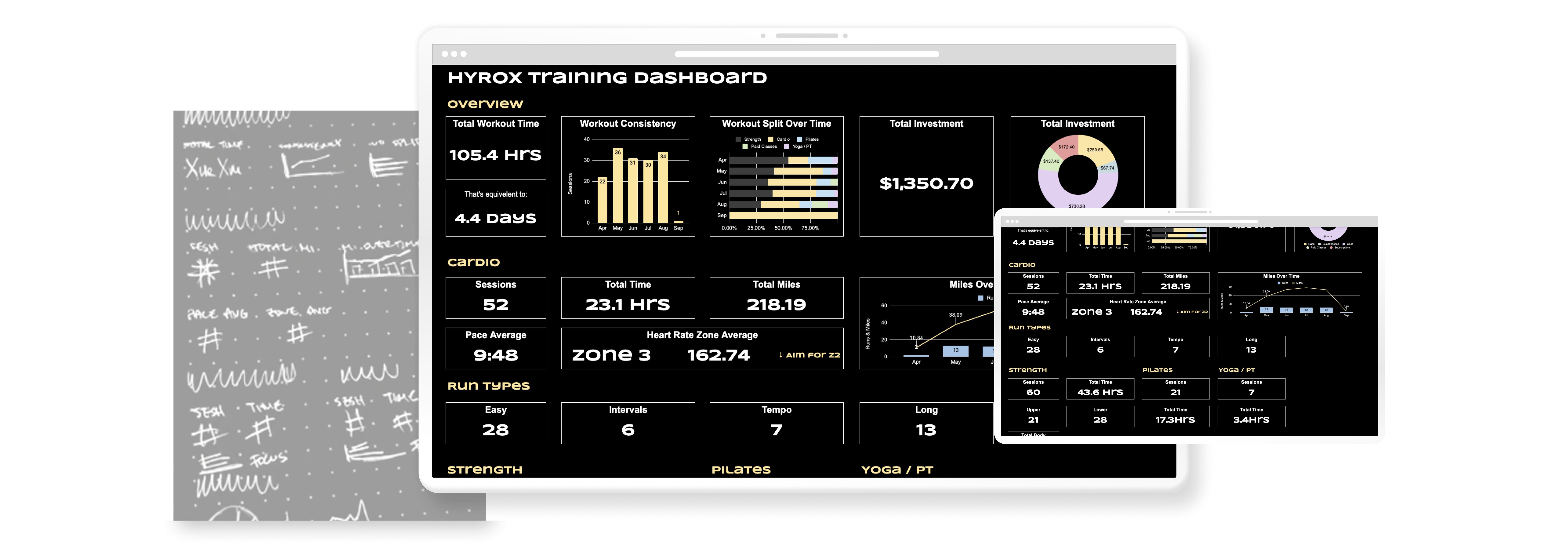
Transforming a rough concept into a dynamic Google Sheets tool.
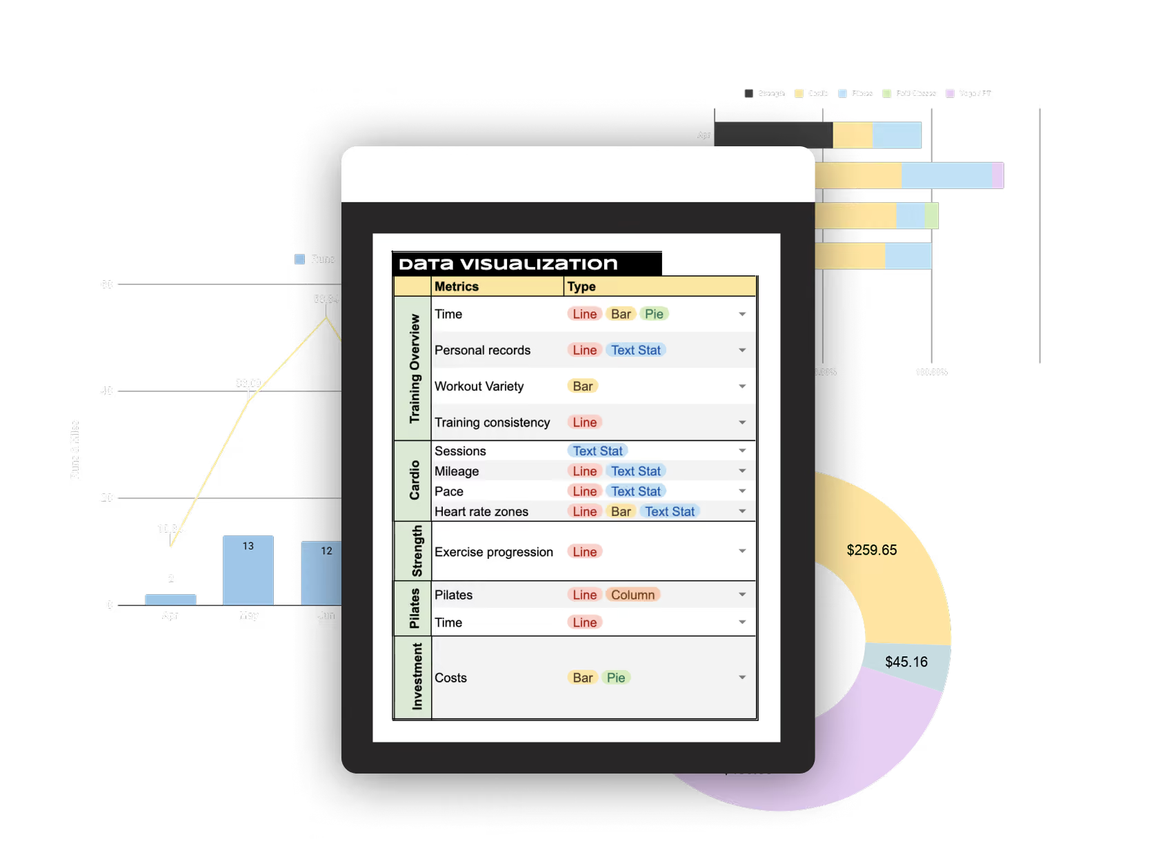
I designed visualizations based on the type of insight each metric needed to communicate, using line charts to highlight progress over time, bar charts for comparisons, and pivot tables for detailed workout history to translate to sythesized insights.
I am still using this dashboard and will continue to iterate as needs or friction come up.
With more dedicated time, resources, and collaborative expertise, here are the wishlist items that I'd love to integrate to create an easier, more comprehensive dashboard: