My Role:
Lead UX/UI Designer
Year:
2023
Tools:
Figma
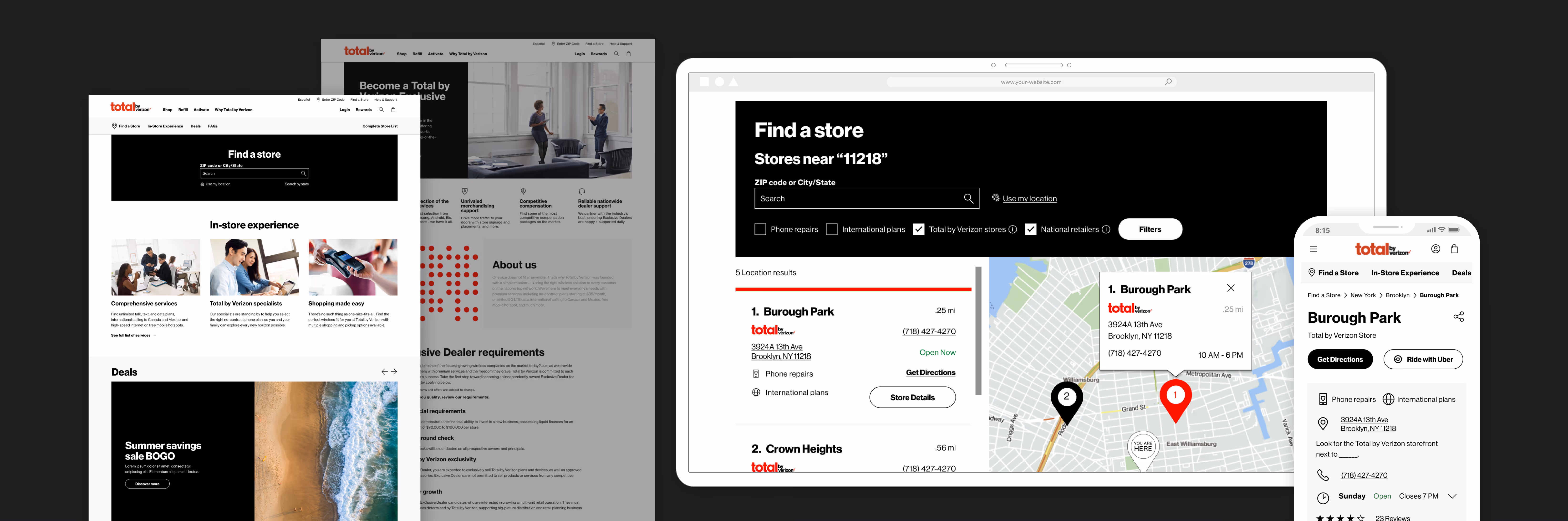
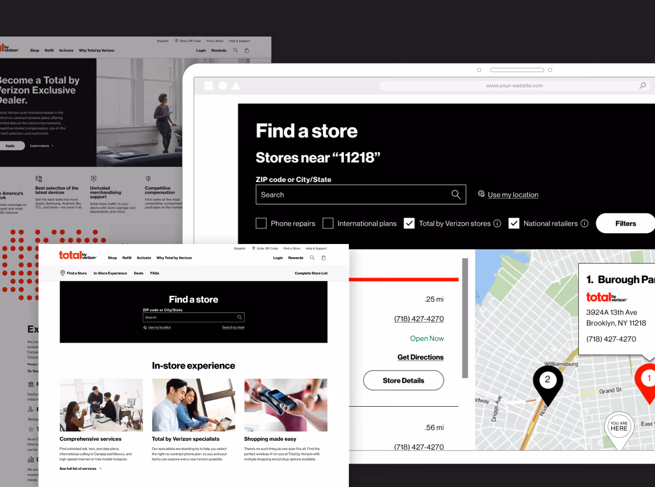
Total Wireless was preparing to launch their new brand as Total by Verizon. Its local store website needed a refreshed look that would seamlessly blend with the global marketing website that was in production.
The acquisition of Total Wireless under the Total by Verizon brand left the local store site disconnected from the new, branded in-store experience. The challenge at hand was to unify the digital local experience with the new brand and its new marketing website.
To establish a strategic foundation, we began with stakeholder intake and project alignment via a structured questionnaire to define goals, constraints, and success metrics.
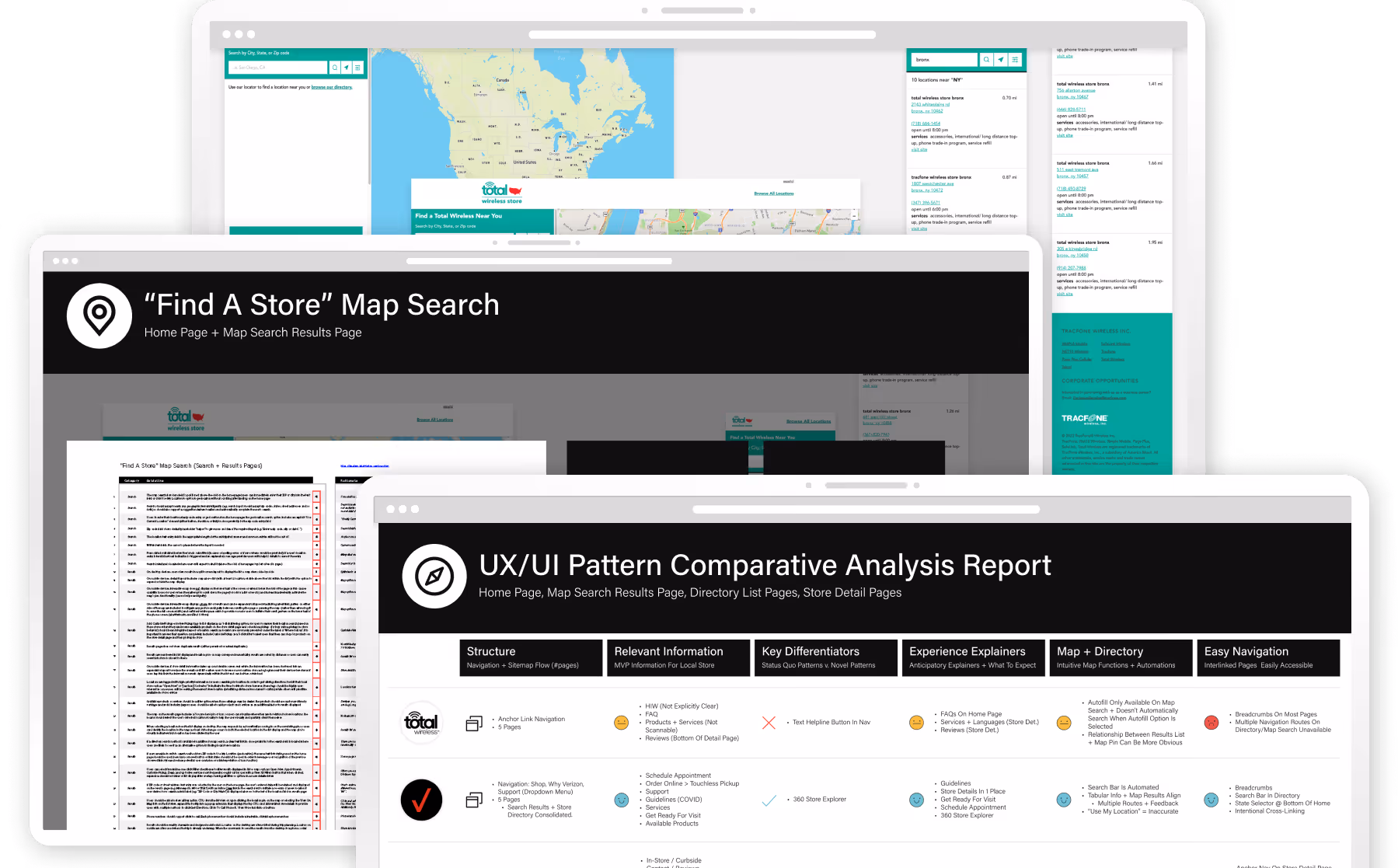
A comparative analysis of eight industry-leading local store experiences helped uncover opportunities to better personalize the journey and bridge the gap between digital browsing and physical retail engagement.
Using those insights, we defined a set of UX north stars centered on delivering anticipated information at the right moment; through clear, intent-driven micro-moments across the user journey.
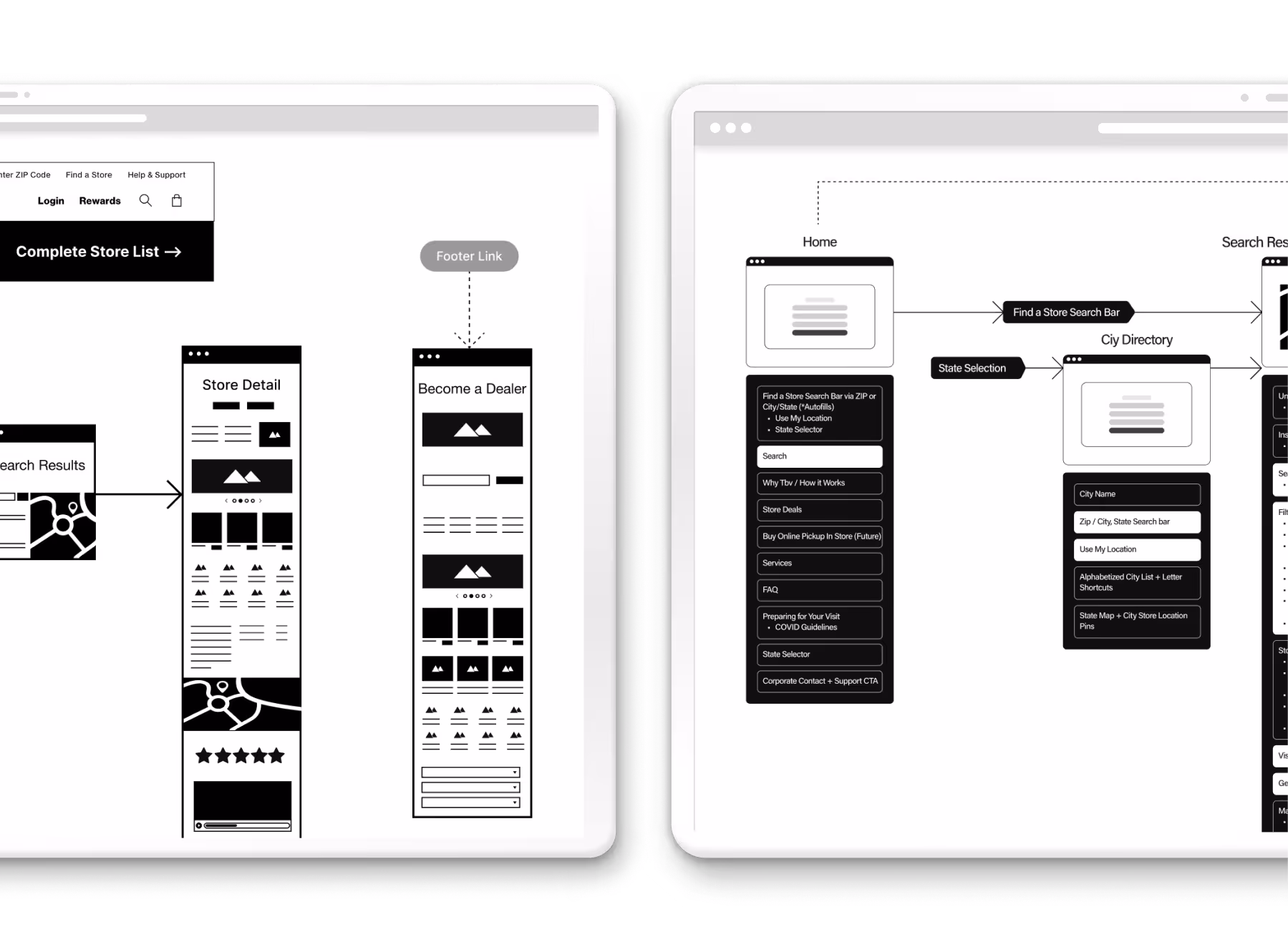
I developed new sitemap and information architecture recommendations, balancing ideal UX improvements with development feasibility and timeline constraints.
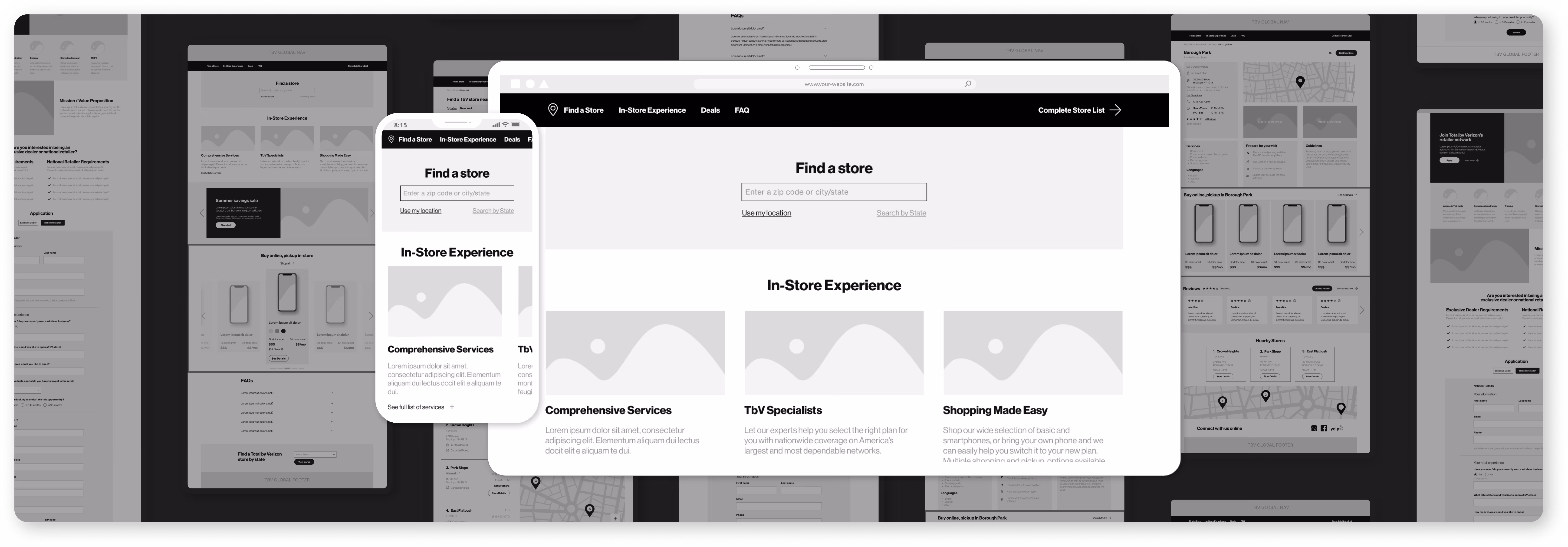
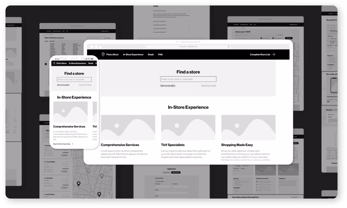
With a clear strategic foundation in place, we translated the experience into wireframes that prioritized scannability, clearer decision-making, and more effective storytelling. This would help users move more confidently from digital search to physical store visit.
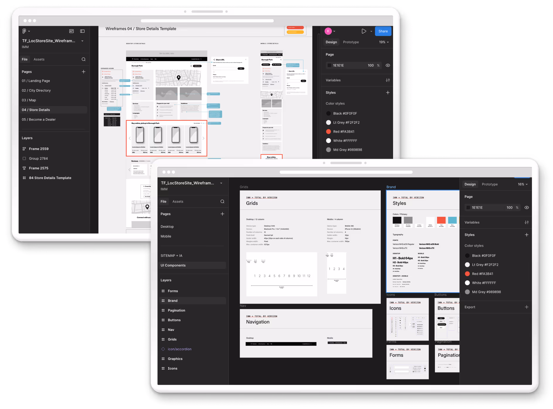
To support a smooth build process, I delivered a thoroughly annotated Figma file and prototypes with detailed interaction notes, UX rationale, and implementation guidance for the development team.
Beyond handoff documentation, we established scheduled touchpoints throughout development to answer questions, clarify design intent, and adapt recommendations as needed. This helped to ensure the final experience stayed aligned with both the strategy and the original design vision.
From intake through developer handoff, we delivered an optimized Find a Store experience that brought Total by Verizon’s new brand to life while improving the customer journey.
The final experience better connected digital and physical touchpoints, making store discovery more intuitive, personalized, and aligned with the brand’s evolving identity.